The information below explains each section of the data dashboard. You can log into your clinic’s dashboard on the Dashboard Log-in tab
This is an accordion element with a series of buttons that open and close related content panels.
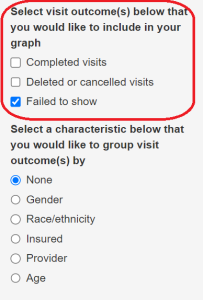
Selecting Outcomes
The top section on the left (grey rectangle) lists the different possible outcomes. One or more outcomes on this list can be selected.
*These screenshots were taken from a sample dashboard, the options on your site’s dashboard may be slightly different.
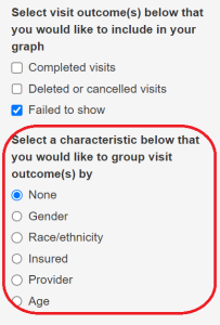
Selecting Patient Characteristics
The bottom section, in the grey rectangle on the left side of the page, lists the different patient characteristics that can be selected. Only one characteristic can be selected at a time.
*These screenshots were taken from a sample dashboard, the options on your site’s dashboard may be slightly different.
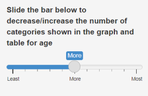
Some of the characteristics have multiple possible options. For example, age can be broken into two large categories or several smaller categories. Control the number of categories viewed by sliding the slider bar below the list of options.
Bar Graph and Monthly Trends
Above the graph on the right side of the page, there are two options, Bar Graph Summary and Monthly Trend.
Bar Graph Summary will generate a summary for the entire time period data is entered for.
![]()
Monthly Trend will give a trend with the specific data points for each month within the entire time period data is entered for.
![]()
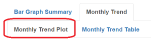
- Under Monthly Trend there are two options: Monthly Trend Plot and Monthly Trend Table.
- Select Monthly Trend Plot to see the data points for each month plotted. Hover over the data point for each month to get the specific number for that month.
- Below the dates are characteristics listed horizontally. Each one can be turned on or off by clicking on the ‘characteristic’. This will add or delete that characteristic from the data plot.
- Select Monthly Trend Plot to see the data points for each month plotted. Hover over the data point for each month to get the specific number for that month.
-
- Monthly Trend Table will show only the specific numbers relating to the outcome selected.
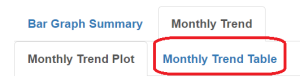
- Monthly Trend Table will show only the specific numbers relating to the outcome selected.
Sample Scenarios:
Below are instructions for three scenarios. These are examples of how you might use the dashboard to look at detailed information about show rates in your dental clinic.
Note: these are only sample scenarios, the options on your site’s dashboard may be slightly different.
This is an accordion element with a series of buttons that open and close related content panels.
To show the overall no-show rate in the clinic
- In the outcomes section, select ’ Failed to show’
- Select ‘None’ in the characteristics section
- The number of ’failed to show’ can be found underneath the Bar Graph Summary
To find the month/year Males have the highest fail to show rate:
- In the outcomes section, select Failed to show
- Select the Gender option in the characteristics section
- Above the graph, select the Monthly Trend option
- Find the highest point and hover over it to see the specific month when male ‘failed to show’ was the highest
To find which of the five age groups has the highest failed to show rate
- In the outcomes section, select the option failed to-show
- Select the Age option in the characteristics section
- On the slider bar that appears below the characteristics section, slide the bar to the right, selecting the “Most” option
- Click on the ‘Bar Graph Summary
- The longest bar will show you which of the five groups had the highest ‘fail to show’ rate. (To confirm which bar is the longest, you can look in the Percent column in the table that is underneath the Bar Graph Summary.)